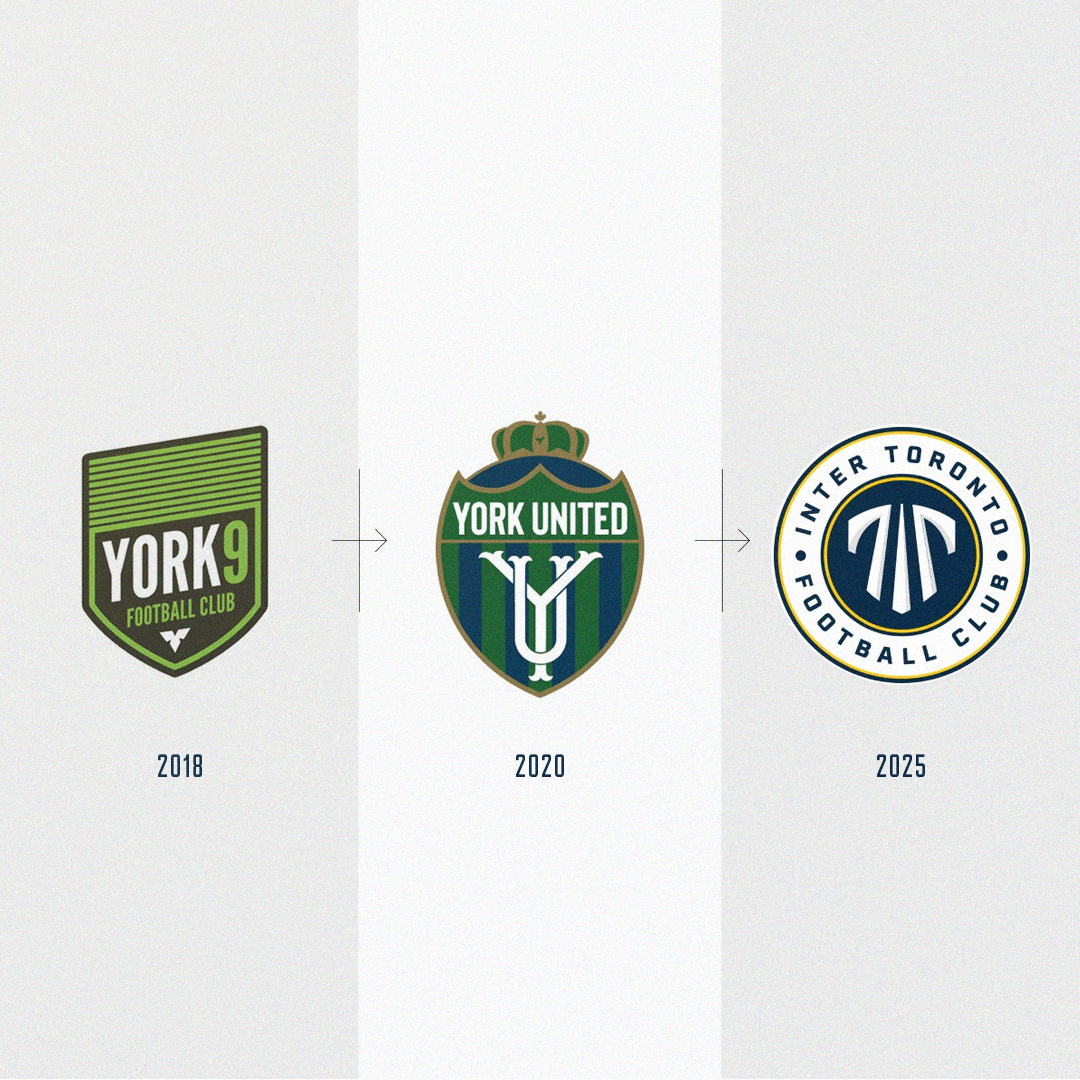
York United Becomes Inter Toronto
In 2025, York United Football Club set out to transform its identity and broaden its reach. The club wanted a brand that better reflected the Greater Toronto Area, one of the most international regions in the world, and that resonated with a wider audience. The result was Inter Toronto FC, a new name and visual identity created through a close partnership between our agency and the club’s internal creative team.
Over the course of nearly a year, we worked together to develop a design system with modern appeal, grounded in the familiar traditions of global football culture.
York United had strong foundations, but the name and crest created an ambiguous sense of geography. The club had strong ambitions to represent the full GTA and speak to the diverse communities that define it.
The task was to create something contemporary and distinctive while maintaining the visual cues and symbolism that give classic football identities their sense of heritage.
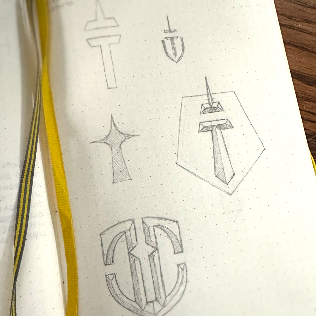
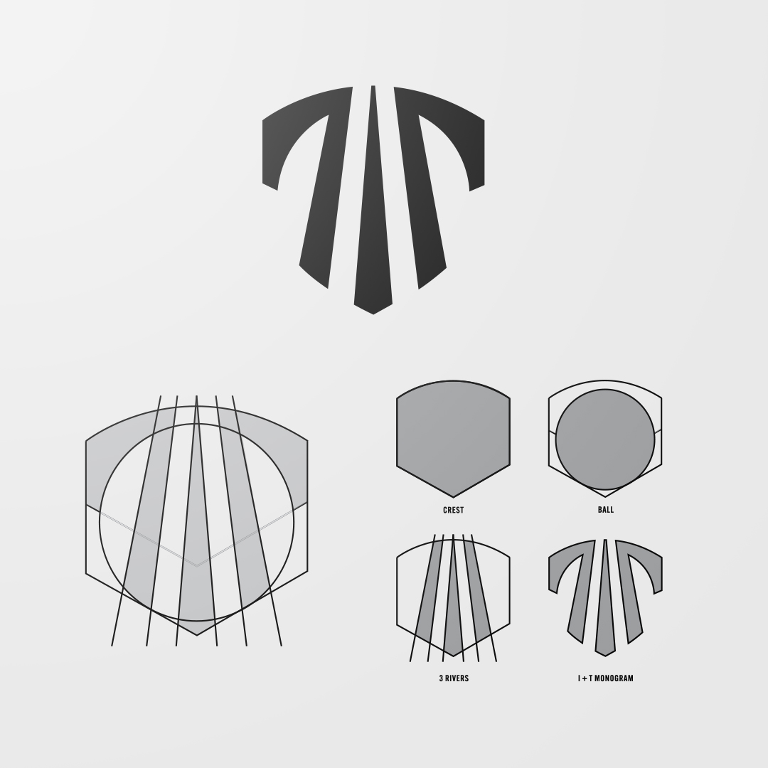
The new identity is built around a classic football crest. The shield shape combines an I and T monogram with several layers of city symbolism. The central mark blends the initials of Inter Toronto into a bold, vertical structure inspired by the city's iconic skyline. It is designed to be instantly recognizable on kits, merchandise, and digital platforms. The overall silhouette merges shield and circular forms in the negative space, referencing both traditional club crests and the universal symbol of the sport. Three vertical forms run through the monogram, representing the Don, Rouge, and Humber Rivers. The 3 Rivers unite the city, flowing in the same direction to their shared destination.
Our teams collaborated throughout every stage of the project to ensure the brand was functional, flexible, and aligned with the ambition and vision of the new ownership. The new identity expands the club’s reach across the GTA and positions Inter Toronto as a club with both international appeal and a clear connection to the city and region it represents.