Helping Build Canada Since 1965
Stephenson’s, a trusted name in Canada’s construction and equipment rental industry since 1954, partnered with us to modernize its brand identity while honouring its longstanding legacy. As the company continues to grow and adapt to a rapidly evolving market, the rebrand provided an opportunity to unify its visual presence and reaffirm its commitment to helping Canada build with confidence.
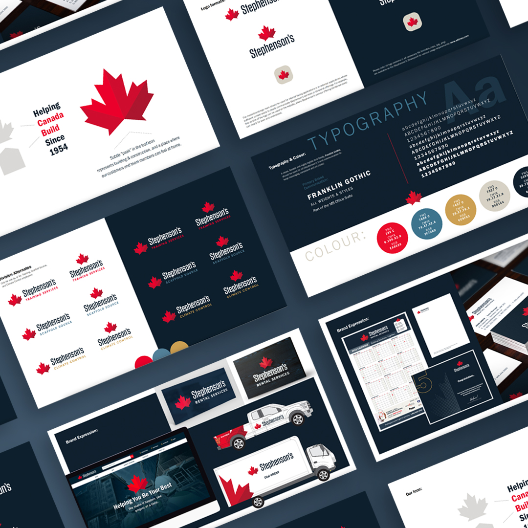
The objective was to create a refreshed logo, identity system, website design, and suite of collateral materials that reflect both the company’s heritage and its forward-thinking approach. Our goal was to balance tradition with innovation, developing a design system that would feel timeless yet distinctly contemporary.
Drawing inspiration from Stephenson’s deep Canadian roots and decades of service, the new logo features a bold, geometric maple leaf as its central symbol. Clean, modern typography complements the symbol, reinforcing clarity, dependability, and technical expertise. Together, these elements create a confident and instantly recognizable visual identity.
The broader visual system builds on this foundation with a refined colour palette, strong typographic hierarchy, and structured layout principles designed for consistency across all applications. From digital platforms and marketing collateral to fleet vehicles, signage, and apparel, every touchpoint was carefully considered to ensure the brand communicates professionalism and trust.
A key focus of the rebrand was developing a cohesive digital presence. The redesigned website serves as a central hub for customers, partners, and employees, combining functionality with clear brand storytelling. It reflects the company’s dedication to service excellence and its leadership within the Canadian construction and equipment rental industry.
The result is a timeless, yet forward-looking, identity that celebrates Stephenson’s hardworking spirit and Canadian heritage. By bringing unity and modernity to every aspect of the brand, the rebrand positions Stephenson’s for continued growth, innovation, and leadership in the years ahead.